I wanted to look at different types of branding rather than just financial branding, so I have picked out a few which really caught my eye. This first one is promoting a blog, and is very feminine, compared to the rest of the designs i have looked at, i like the way they have laid out the design with the circles in small and big photographs. I also think the colour palette works really well.


Branding such as the one below is really appealing to me as it incorporates a hand rendered feel to it, even thought it has been done by this stamp, it looks authentic and almost vintage.

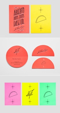
This design is again very simple but looks particularly good and significantly better simply by the fact it is photographed well, as it has been taken on a red background which matches the colours in the design it makes the design stand out, and almost looks three diminutional.

This Swiss air branding works really well and although it is simple and uses only one colour it really stand out, the orange works well with the different shades of grey and the black makes the whole logo really stand out.

No comments:
Post a Comment