Friday, 30 September 2011

Alphabet soup

The brief was set on monday, and the task was to produce a set of 10 letters which worked together and portrayed which ever word we were given. the letters had to be in black and white, and no more than one letter per 15cm box.   I was given the word Build, so I started by looking at definitions for the word, here are a few I found.
  • To form by combining materials or parts
  • To order, finance, or supervise the construction of something
  • To develop or give form to according to a plan or process; create or build a nation for example
  • To increase or strengthen by adding gradually to: like money building interest in a savings account.
  • To make something by combining materials or parts.
  • To engage in the construction or design of buildings.
  • To develop in magnitude or extent
  • To progress toward a maximum, as of intensity

I wanted to include some images of Alphabets just to get some ideas for shapes of letters, I really liked these particular ones which I researched for our summer project.the ones i have chosen as examples are relevant to my project as they are all "built up" from different objects and materials.


I  have looked at Alphabet sets as i wanted to research layout and how the letters work together.

After looking at alphabets I looked more specifically at the letter which I was going to focus on, I have included some example of the letters which I am basing my letters on.

As well as looking at individual letters I have also researched typography which is related to the word build, i wanted to gather some type which used Build in different contexts. Such as the text below, which is made up of different materials. 


 I like this piece of type, the words build up to a volcano and then explodes, i wanted to show different ways of using the word build


I really liked this type it works well and fits in with the word "build"

Wednesday, 28 September 2011

5 pieces of graphic design i am very fond of...


Ulla Puggard is a Danish designer, she is also involved in textile design sculpture and interior design. this particular piece of work was done for Topshop. I like it as it is simple but stands out.

Mia Marie Overgaard is from Copenhagen in Denmark she does everything from fashion illustration to Editorial peices. I chose her work as i like the colours she uses and the contrast between hand drawn and digital.

Raphael Vicenzi is one of my favourite designers, he Calls himself My Dead Pony, and his work is a blend of symbolism, street art, typography and social critique 
Oh year studios I  wanted to look at this Group of designers who do hand drawn shapes and images with geometric shapes and a palette of a few colors. 

Alberto Seveso- I looked at this artists work back in foundation and i been a big fan of his work ever since,  i was drawn to his work as they are all quite similar and often use the same type and colors.

Friday, 23 September 2011

file://localhost/Network/Servers/mendez.academic.lcad/smedia/ba_graphic_design/kw104060/Desktop/Fashion%20horror%20stories.psd

Thursday, 22 September 2011

Stripes

Had a quick look at different patterns of stripes, in animals and clothing etc. Here are a few.


Had a quick look at different patterns of stripes, in animals and clothing etc. here are a few

Looking at Fashion Blogs

I wanted to quickly look at fashion blogs as one of our original ideas was to create a blog which would give people ideas about ho to go about Stripy friday in style, without wearing the same things everyday. here are a few I found,


Street peeper looks at Fashion around the world, how people put outfits together, i thought this was relevant as the blog we would produce would include images and information about where to go for stripes and in what ways stripes can be worn, in a way which is current.


Fashion Toast is particularly good in the sense that it is a collection of photographs taken by its producer, of every outfit she wears. Even though it isn't based on stripes the idea behind this blog is relevant. this lead me on the think about a blog which includes images of ordinary people on the street, who are wearing stripes successfully 


Where did you get that is a blog produced by a londoner living in new york. AS many are she is faced with problems when she moves to New York and finds she is clueless about when it came to shopping. the blog is the result of her findings.


Researching Survival guides

So we started the How To brief on Friday and Were Given the problem of "How to avoid that awkward moment when you forget to wear stripes on stripy friday"
Researching Survival guides
Stripey Friday quite obviously occurs every Friday, in the graphics department, everyone must wear at least one item of stripey clothing to avoid being mocked by Fred and other Tutors. We have decided to to solve the problem by creating posters, and a smartphone app.

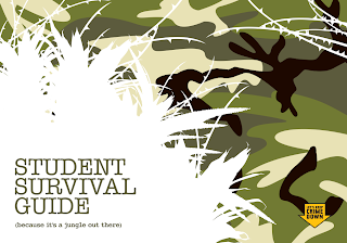
I have started researching student survival guides as I think it is particularly relevant, This one grabbed my attention instantly, it has bright colours and its layout is very straight forward. this one is a general guide to being a student, it covers issues such as money, health, going out, Drugs and Alcohol and many more, I thought this would be interesting to look at as it gives an incite into being a student and  coping with small budgets.


Wednesday, 21 September 2011

Teaser posters

Teaser posters are a possibility for a final piece, and so research into Teaser posters which have been used to advertised and promote films, plays and other forthcoming events is very important for this project! As a teaser poster only hints at what a film or play will include it creates a sense of curiosity and therefore can lead to a website of event. Here are a few Teaser posters, found from all different types of film and event.


 This poster is particularly attractive, the type and colour makes it stand out from the rest of them. 

 This poster here is a film poster and not a teaser poster the difference is that a film poster has the names of the Actors and Actress's starring in the film and usually there faces of a scene from the film whereas teaser posters don't have either of these.

Tuesday, 20 September 2011

//Alphabet Soup//

Over the summer we war asked by the college to produce an alphabet which visually represented us as individuals. When looking at them as groups we discovered we all had very different alphabets, in terms of layout, style and how we all used materials. We were asked to decide on 10 similarities which our work had in our blog groups. Collectively we decided they we are good and all had different positives to them, but overall decided that Eve's work worked the best as a piece. these are the 10 similarities we came up with.

1-The majority of our alphabets were hand drawn, or at least crafted by hand first before being formatted digitally.
2-The majority used primary imagery to create the actual typefaces.
3-The majority were researched within the medium of the internet, or from magazines and photographs.
4-Everyone incorporated personal interests.
5-The majority used colour in the presentation.
6-Two of the five were created digitally, using photoshop as a main tool.
7-In several of the alphabets, a pre existing font has been used.
8-There is a uniform style, and most of our alphabets work cohesively and in sequence.
9-Everyone's alphabet linked together well as a small collective.
10-Everyone has incorporated imagery into the alphabet.